December 31 2022
SudokuAI: Instantly Solve Any Sudoku Puzzle with Your iPhone
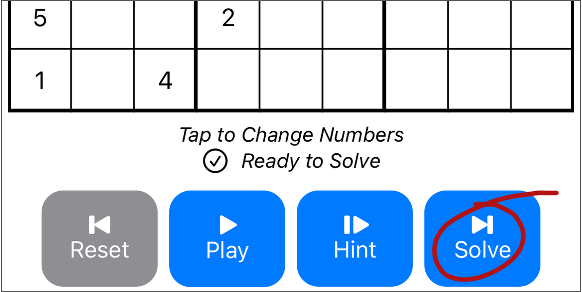
Before I started this side project, I had tried Sudoku a handful of times. Then, my friend sent me this excellent article by Peter Norvig titled Solving Every Sudoku Puzzle, and I wrote about the algorithm in How to Solve Any Sudoku Puzzle in One Second. Productizing that algorithm into an iPhone app seemed like a fun reason to learn Swift.
My original vision for this app was one screen: a camera view that automatically recognized a Sudoku puzzle, highlighted the numbers with Apple’s yellow box (like QR codes get), and solve it on the fly, superimposing the calculated numbers over the image in real time. I thought I could learn Swift, SwiftUI, and iOS’s image recognition. This is not that app.
Brainstorming is a fantastic avenue to thinking about what’s possible, but all projects, especially side projects like this one, are constrained by time and resources. SudokuAI is a far simpler app. It does have image recognition, but the process doesn’t involve floating yellow boxes. It solves puzzles in real time, but the result isn’t superimposed on a real-time image. SudokuAI also covers a couple more use cases than the original version did: creating a new Sudoku puzzle, using an image from Photos, or getting just a hint.
Most importantly, SudokuAI is shipping on the App Store now. It’s the most important aspect because without shipping, people don’t have the opportunity to try the app.
Shipping a product highlights the tension between Product Management and Engineering. Product Management wants to deliver the best experience to the customer, but Engineering is tasked with implementing the experience. Features that sound simple or fun to customers can translate into untenable requests for Engineering, like floating yellow boxes with superimposed numbers for someone who has never written Swift working on a side project. Delivering a new product requires understanding the needs of customers in addition to the resources of the team and finding the best intersection between them.
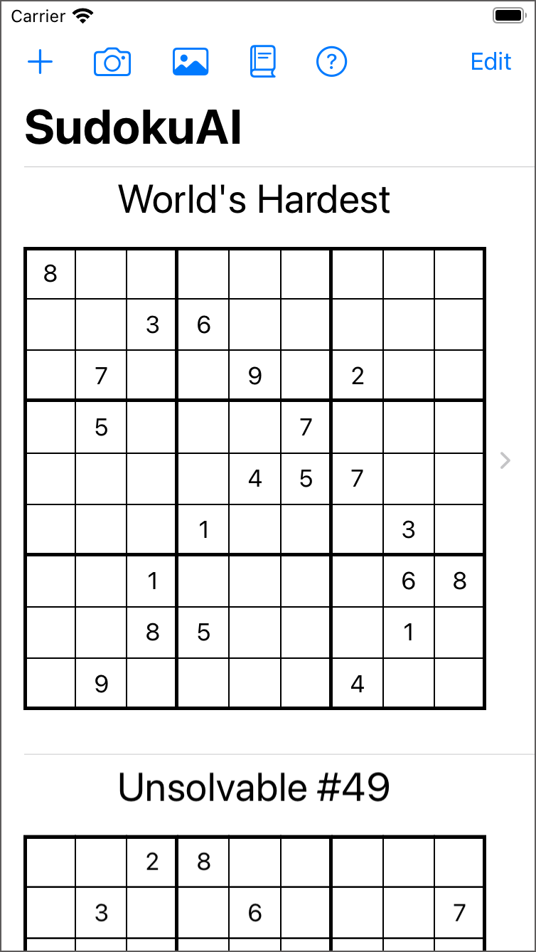
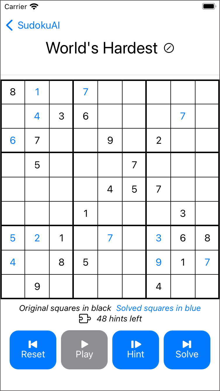
I iterated many times on the design both to simplify the interaction and to enable me to implement it.
Simple is Hard
My original vision for the app was derailed as soon as I looked into Apple’s documentation for image recognition. I thought that those yellow rectangles might be part of an API for VisionKit. They were not, and I wasn’t interested in building them. Moreover, the original version didn’t account for creating new puzzles, importing digital photos of puzzles, or getting a hint.
I pivoted to having a list of puzzles. The user could try a pre-loaded puzzle, create a new one, or import one from the camera or photo roll, and they could watch autoplay, get a hint, or solve it instantly. That list of use cases seemed reasonable and achievable. Still, those use cases could be surfaced with many different user interfaces.
I settled on buttons along the top of the list view for puzzle ingestion: plus, camera, photo. Toolbar items like these are a standard iOS style.

The puzzle interaction workflows were far harder to get right. I started with the music player analogy: back, play/pause, next.


Interacting with them wasn’t a great experience though. “Back” should always be a reset for the puzzle. “Next” doesn’t cover both use cases: hint and solve. I abandoned the music analogy and switched to words: “Solve”, “Hint”, and “AI” (for autoplay). Tapping “AI” switched the buttons to “Pause AI” and “Reset AI”.
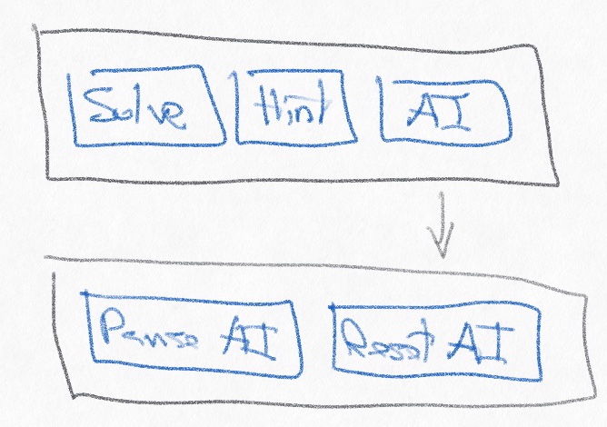
That interaction felt awkward. I iterated on the words with “Solve” and “AI”. Tapping “Solve” switched to “Answer” and “Hint” with “Reset”. Tapping “AI” switched to “Reset” and “Pause” with a play rate slider. The slider would allow users to slow down or speed up autoplay, seeing what choices the algorithm made to proceed through the problem space.
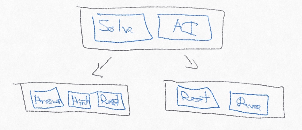
That workflow was far too awkward. This app was supposed to be simple. I returned to the music player analogy with a small tweak: “Reset” (Back), “Play”/“Pause”, “Hint” (Next), “Solve” (End).

These buttons addressed the use cases and were easy to implement, and they translated well to the high-level pitch for the app:
- Solve Sudoku Instantly
- Tap for a Hint
- How to Solve Any Puzzle
I got tired of adding puzzles manually into the app and added a toolbar item for importing a default set of puzzles: Norvig’s example along with the three hardest puzzles I could find.
The final addition to the app was the tutorial. The first question during beta testing was what exactly the app did, so I added the tutorial and a question mark button to bring up the Help section any time.
SudokuAI is not a complicated or flashy app, but it achieves what the goals were.
Technical Difficulties
I’ve used Objective-C, Cocoa, and Interface Builder (NIBs/XIBs) for over a decade, writing 50k lines of code to create the user interface for Retrospect Backup for Mac, but Apple’s moved on to Swift. I had zero knowledge of Swift when I started this app.
The initial problem was learning enough Swift to implement the algorithm, but productizing R&D doesn’t just mean wrapping a UI around some research. Features like “Tap for a Hint” meant deciding how to store and surface the intermediate steps of the algorithm, and the “Play”/“Pause” buttons required the algorithm slow down and occasionally stop at the user’s request. Adding the plumbing for those user-facing features required extending the original algorithm to support new use cases.
Next, when should the app actually solve a puzzle? When the user hits “Solve”? When it’s created? The design choice depends on the engineering capabilities. Luckily, solving any known puzzle takes 1.2 seconds at maximum, about 1400 steps in the algorithm. Based on that, I created an upper bound, declaring “No Solution” if the algorithm exceeds 2000 steps in its search. Because the time was short enough, I opted to solve a puzzle for every change. By always having a solution or failing after a certain number of tries, the app could then display if there was a solution, providing great feedback to users who are editing a puzzle.
The UI is built in SwiftUI. SwiftUI is drastically different working with XIBs in Interface Builder. In fact, Apple EOL’d Interface Builder in 2011 and rolled it into Xcode before replacing it with SwiftUI. SwiftUI is declarative code (as opposed to imperative code), meaning you can write what you want, not exactly how you want it. The following code becomes a list with PuzzleCell as the table view’s cells and “SudokuAI” as the title.
NavigationView {
  List {
    ForEach(items) { item in
      PuzzleCell(item: item)
    }
  }
  .listStyle(PlainListStyle())
  .navigationTitle("SudokuAI")
}
With SwiftUI, I could easily write UI code (with only a few conditional statements) that worked on any iPhone and iPad on both portrait and landscape. Coming from Interface Builder, the experience was both transformative and incredibly frustrating: amazing because very little code can become a functioning UI and annoying because that UI might not be exactly what I wanted. Learning SwiftUI informed the app’s design by seeing what was easy and shippable.
Beyond solving the puzzle, the app needed to ingest puzzles, either by user creation or by import and image recognition. The goal was to do a reasonable job of recognizing a Sudoku puzzle in an image and extracting the numbers from it. VNRecognizeTextRequest in Apple’s VisionKit was a great API to accomplish this with minimal effort, but it took a number of tries to find the correct parameters. Thanks to Apple’s Locating and Displaying Recognized Text sample project for making attribute testing easy for sample puzzle images.
textRecognitionRequest = VNRecognizeTextRequest(completionHandler: recognizeTextHandler)
textRecognitionRequest.recognitionLevel = .accurate
textRecognitionRequest.usesLanguageCorrection = true
textRecognitionRequest.recognitionLanguages = ["en-US"]
textRecognitionRequest.usesCPUOnly = false
textRecognitionRequest.revision = VNRecognizeTextRequestRevision1
For a given image, iOS’s VisionKit API provided a list of character guesses with their location in the image. The app needed to estimate the spacing between the recognized numbers, including where the puzzle started and stopped within the image, so the code first guesses the surrounding box size and then assigns each character to a square, adding blanks for spaces that contain no number. The algorithm works well if the user crops the image to only include the puzzle. To help the user correct any errors, I overlay the recognized puzzle on top of the image, so that the user can tap on each square to correct the number. The app uses the same workflow to create a new puzzle.
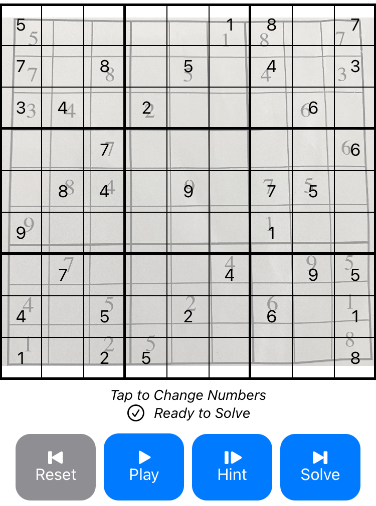
With camera support, photo roll integration, and puzzle creation, SudokuAI gives users a couple different workflows for ingesting puzzles. Solving puzzles instantly on any change allows the app to display a status like “Ready to Solve” or “44 hints left”. Letting users tap to change each square ensures any image recognition errors can be easily fixed. SwiftUI enables me to bundle these features into a simple UI.
Available Now
SudokuAI is available for free from the App Store. It is compatible with iOS 15 and later on iPhone and iPad. The source code is available on GitHub at bdunagan/SudokuAI under MIT license.
Despite its name, the underlying algorithm is simply constraint propagation and search, neither of which is AI (artificial intelligence) or ML (machine learning). SudokuAI just seemed like a catchy name.
