May 3 2012
Writing Retrospect for iOS

At WWDC 2009, Eric Hope talked about crafting the best iPhone apps at his iPhone User Interface Design session (the one where Cultured Code likened public speaking to kryptonite). The first step was coming up with an Application Definition Statement. It should define what your app is and what it isn’t. The statement should include a differentiator (your app’s strength), a solution (the problem you’re solving), and an audience (the people who care), or as my Ruby-esque notes read, “#{differentiator} #{solution} for #{audience}”. The goal of the statement was to focus your app. Mac apps could have a long list of features, but the iPhone was a far more constrained environment. Hope’s example was iPhoto. On the Mac, it views, edits, shares, prints, and what not; on the iPhone, it shares, nothing else.
That talk was almost three years ago. Things have moved forward. The iOS environment is less constrained, particularly with the iPad. Apps can do more, and iPhoto is a great example. In March, Apple released an iPhoto for iOS that contained editing abilities.
Retrospect for iOS has followed a similar path. What started as a very simple app has grown up a bit.
Retrospect for iOS 1.0
I wrote Retrospect for iOS 1.0 in December 2009, just for fun. For the Application Definition Statement, I came up with “a serious tool to monitor multiple Retrospect servers”. No control, just monitoring. I focused on activities. Viewing activities for a Retrospect server gives administrators a high-level view into what’s going on. If everything looks good, no action required; if not, they should launch Retrospect for Mac to dig deeper. Our designer hand-crafted a set of awesome icons, and we submitted it to the App Store.

The app was a moderate success. It was downloaded around 5,000 times and received a glowing review from Economist writer Glenn Fleishman (a long-time Retrospect user), who praised its “outstanding distillation”. The app didn’t do much beyond viewing activities, but it did that task well. Still, it didn’t replace Retrospect for Mac, and it didn’t support the iPad. Just as Apple updated its definition of what iPhoto for iOS was, I recently decided it was time for Retrospect for iOS 2.0.
Retrospect for iOS 2.0
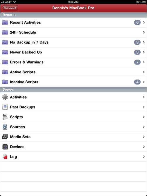
What did the first version lack? Control. Complete monitoring. Better server support. iPad support. That’s the list I came up with in December 2011. I decided the app should display everything that the Mac version did: Activities, Past Backups, Scripts, Sources, Media Sets, Devices, and Reports. I even added badges to each report. I added full support for the latest Mac and Windows Retrospect servers and partial support for a couple versions before those. And I finally enabled control within the app: running scripts. I submitted v2.0 in February.

Close but not quite. While most of the new features were significant improvements, one failure erased all of those gains: syncing. Retrospect stores quite a bit of information, and when I expanded the list of items displayed on the iOS app, it translated into syncing times that were 10x to 100x longer. The UI prevented the user from looking at a server until it was synced, so the user might launch the app but then wait a long time before being able to monitor the server. Moreover, the iPad UI did not take advantage of the space. It looked like an iPhone app at “2x” but without the pixelation.
Retrospect for iOS 2.1
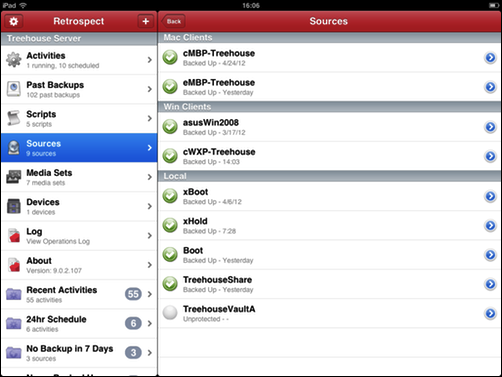
With v2.1, I fixed those two issues. Syncing is now done by item type. Users can view activities before media sets finish syncing. I also added split-screen support to the iPad UI to make better use of the space available.

This latest version of Retrospect for iOS is now available on the App Store. If you use Retrospect and have an iOS device, give it a try. It’s free.
