December 14 2011
Creating UITableView badges like iOS Mail

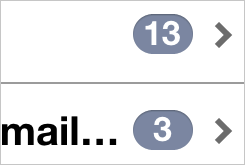
Apple’s iOS Mail has a universal inbox on iOS 4. Very handy in general, but its unread badges complete the feature. I frequently glance down the list of email addresses I have and know exactly what the state of my inboxes are. I never have to wonder how many new emails I have. I just check the numbers.
Recently, I needed to duplicate that feature for work. I found two existing solutions:
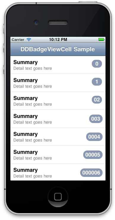
I ended up forking DDBadgeViewCell. It was concise, and I only needed to make a couple changes to it. Specifically, I wanted the badges to look exactly like Mail’s badges, in terms of alignment, colors, and shadows. I’ll go through my changes here, but you can check out my GitHub fork as well. See the image for the resulting look:

Badge color
I wanted to duplicate Mail’s look and feel, so I needed the exact colors that Mail uses for its badges. xScope made it easy.
UIColor *badgeColor = [UIColor colorWithRed:0.55 green:0.6 blue:0.69 alpha:1.];
UIColor *badgeShadowColor = [UIColor colorWithRed:0.45 green:0.49 blue:0.57 alpha:1.];
Badge shadow
If you look closely at Mail’s badges, you’ll notice the top part of the arc looks indented. The shadow gives the label a feeling of depth; the badge looks almost letter-pressed. To duplicate that look, I simply drew a darker oval one pixel higher than the original before drawing the real one.
// Draw the badge shadow.
CGContextSaveGState(context);
CGContextSetFillColorWithColor(context, currentBadgeShadowColor.CGColor);
CGMutablePathRef shadowPath = CGPathCreateMutable();
CGPathAddArc(shadowPath, NULL, badgeViewFrame.origin.x + badgeViewFrame.size.width - badgeViewFrame.size.height / 2, badgeViewFrame.origin.y + badgeViewFrame.size.height / 2, badgeViewFrame.size.height / 2, M_PI / 2, M_PI * 3 / 2, YES);
CGPathAddArc(shadowPath, NULL, badgeViewFrame.origin.x + badgeViewFrame.size.height / 2, badgeViewFrame.origin.y + badgeViewFrame.size.height / 2, badgeViewFrame.size.height / 2, M_PI * 3 / 2, M_PI / 2, YES);
CGContextAddPath(context, shadowPath);
CGContextDrawPath(context, kCGPathFill);
CFRelease(shadowPath);
CGContextRestoreGState(context);
Pixel Perfect
DDBadgeViewCell does an excellent job when there are three or more characters in the string. But as I wanted to display numbers, I needed to special-case the code a bit to get the pixels correctly aligned.
// Set up the badge's frame.
CGSize badgeTextSize = [self.cell.badgeText sizeWithFont:[UIFont boldSystemFontOfSize:18.]];
CGRect badgeViewFrame = CGRectIntegral(CGRectMake(rect.size.width - badgeTextSize.width - 24, (rect.size.height - badgeTextSize.height - 4) / 2, badgeTextSize.width + 14, badgeTextSize.height + 4));
if ([self.cell.badgeText length] < 3) {
    // Fix the width for 1-2 characters.
    badgeViewFrame = CGRectIntegral(CGRectMake(rect.size.width - 46, 13, 34, 25));
}

// Draw the badge shadow oval and the badge oval...

// Draw the number on the badge.
CGContextSaveGState(context);
CGContextSetBlendMode(context, kCGBlendModeClear);
if ([self.cell.badgeText length] == 1) {
	// CGRectInset cuts off the label by a couple pixels, so need a bit more tweaking.
	CGRect badgeTextFrame = CGRectInset(badgeViewFrame, 11, 2);
	badgeTextFrame = CGRectMake(badgeTextFrame.origin.x + 1, badgeTextFrame.origin.y, badgeTextFrame.size.width + 2, badgeTextFrame.size.height);
	[self.cell.badgeText drawInRect:badgeTextFrame withFont:[UIFont boldSystemFontOfSize:18]];
}
else if ([self.cell.badgeText length] == 2) {
	// CGRectInset cuts off the label by a couple pixels, so need a bit more tweaking.
	CGRect badgeTextFrame = CGRectInset(badgeViewFrame, 6, 2);
	badgeTextFrame = CGRectMake(badgeTextFrame.origin.x + 1, badgeTextFrame.origin.y, badgeTextFrame.size.width + 4, badgeTextFrame.size.height);
	[self.cell.badgeText drawInRect:badgeTextFrame withFont:[UIFont boldSystemFontOfSize:18]];
}
else {
	CGRect badgeTextFrame = CGRectInset(badgeViewFrame, 7, 2);
	badgeTextFrame = CGRectMake(badgeTextFrame.origin.x, badgeTextFrame.origin.y + 1, badgeTextFrame.size.width + 4, badgeTextFrame.size.height);
    [self.cell.badgeText drawInRect:badgeTextFrame withFont:[UIFont boldSystemFontOfSize:18.]];
    CGContextRestoreGState(context);
}
CGContextRestoreGState(context);