June 19 2011
Developers: Just Handle It
I've talked about thinking like the user. I've talked about feeling for the user. But honestly, developers aren't users. Especially when it comes to their own apps. Developers know exactly how their apps work. They wrote it. They made a hundred decisions that led to their app's user experience. Why would they encounter problems with their own mental model? But users inevitably will. My advice: just handle it. Developers should listen to their users and transparently handle other mental models.
Remind Me Later
![]()
Remind Me Later had this problem. When people downloaded the app from the Mac App Store, the app went to their /Applications folder, and its icon was added to their dock. So, the user clicked the dock icon. Remind Me Later's dialog appeared, because on launch, I show the dialog. However, some users associated the dock icon click with the dialog's appearance, because they didn't notice the menu bar icon appear. People complained.
My first pass at a solution was a pulsing menu bar icon. When someone clicked the dock icon to launch the app, the app's menu bar icon pulsed blue four times. I thought people would notice this. Wrong. People still complained.
My second pass acknowledged the root problem. Some people don't understand the dock. They don't get the menu bar. They just want the stupid dialog to appear. The first click on the dock icon makes the dialog appear; that means the second click should. Luckily, Cocoa's NSApplication provides that exact delegate method:
# NSApplication method
- (BOOL)applicationShouldHandleReopen:(NSApplication *)theApplication hasVisibleWindows:(BOOL)flag;
Now in Remind Me Later, clicking the dock icon makes the dialog appear. Every time.
LaunchBar, Alfred, and QuickCursor
![]()
I'm not alone in coming to this conclusion either. Those popular productivity apps, LaunchBar and Alfred, both support that interaction. Click on the dock icon; the main window appears, every time. However, I'll bet both of them added that workflow after someone complained. On the other hand, QuickCursor provides no help when I click the dock icon. The first click puts the icon in the menu bar, but I might not notice that. The second click does nothing. (Keep in mind that QuickCursor is a brilliant app, along with the rest of Jesse Grosjean's Hog Bay portfolio. This post was written in WriteRoom.) Every dock icon click should open the menu in the menu bar. That interaction should help the user associate the menu bar icon with the app.
Jing
![]()
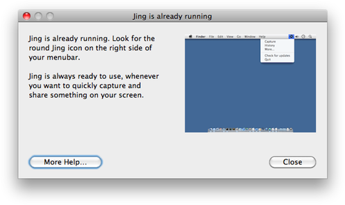
Jing takes a different approach. When I click on the dock icon a second time, it pops up this explanatory message. Yes, it's better than nothing. But no, it's not great. Why not just trigger the menu in the menu bar? Or the "Capture" action? TechSmith produces great software, so I find it strange to find such an odd workflow from them. Show the user; don't tell the user.

So, developers, just handle it. Because your mental model isn't the only mental model.