April 26 2009
Core Animation on the iPhone
Core Animation makes the iPhone awesome. All the nice visual cues that Apple’s built-in apps gives users are courtesy of Core Animation. How apps jiggle around when I’m moving them. How moving messages in Mail involves a flying message icon and a satisfying blue pulse from the selected folder. How terminated apps shrink into nothingness in the middle of the screen. All thanks to Core Animation. It enables developers to easily provide direct manipulation (one of Ben Schneiderman’s many excellent contributions) to their applications.
Following on my last post, Core Animation on the Mac, I ported the animation code to the iPhone.
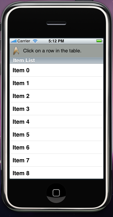
In this case, I mocked up the view in Mail where the user moves a message to another folder. There is a bar along the top for the icon (a Star Trek one from the Iconfactory) and a short description. Below it is a UITableView list of items. When the user clicks on an item, the icon flies into the item, and then the item pulses. Instead of duplicating Mail’s blue pulse, I reused the Yellow Fade Technique from the last post.

Icon Animation
The icon animation code is almost the same as the Mac version. Instead of driving the animation through an NSView, I control it through a CALayer; I add animation objects to it keyed on its position and then assign it a new position.
/*
 * Icon animation
 */

// Determine the animation's path.
CGPoint startPoint = CGPointMake(buttonFrame.origin.x + buttonFrame.size.width / 2, buttonFrame.origin.y + buttonFrame.size.height / 2);
CGPoint curvePoint1 = CGPointMake(startPoint.x + 250, startPoint.y);
CGPoint endPoint = CGPointMake(cellFrame.origin.x + 20, cellFrame.origin.y + topView.frame.size.height);
CGPoint curvePoint2 = CGPointMake(endPoint.x + 100, endPoint.y - 100);

// Create the animation's path.
CGPathRef path = NULL;
CGMutablePathRef mutablepath = CGPathCreateMutable();
CGPathMoveToPoint(mutablepath, NULL, startPoint.x, startPoint.y);
CGPathAddCurveToPoint(mutablepath, NULL, curvePoint1.x, curvePoint1.y,
					  curvePoint2.x, curvePoint2.y,
					  endPoint.x, endPoint.y);
path = CGPathCreateCopy(mutablepath);
CGPathRelease(mutablepath);

// Create animated icon view.
[animatedIconView release];
animatedIconView = [[UIImageView alloc] init];
[animatedIconView setImage:icon];
[animatedIconView setFrame: CGRectMake(startPoint.x, startPoint.y, 32, 32)];
[animatedIconView setHidden:NO];
[enclosingView addSubview:animatedIconView];
CALayer *iconViewLayer = animatedIconView.layer;

CAKeyframeAnimation *animatedIconAnimation = [CAKeyframeAnimation animationWithKeyPath: @"position"];
animatedIconAnimation.duration = 1.0;
animatedIconAnimation.delegate = self;
animatedIconAnimation.path = path;
animatedIconAnimation.timingFunction = [CAMediaTimingFunction functionWithName:kCAMediaTimingFunctionEaseIn];
[iconViewLayer addAnimation:animatedIconAnimation forKey:@"animateIcon"];

// Start the icon animation.
[iconViewLayer setPosition:CGPointMake(endPoint.x, endPoint.y)];
Yellow Fade Technique
The yellow fade animation is very different. There is no NSGraphicsContext on the iPhone. Instead of re-implementing drawLayer:, I simply give the NSView the appropriate properties and change its alpha value through animation code. The new code is much shorter and takes advantage of Core Animation’s repeat and auto-reverse methods.
/*
 * Yellow fade animation
 */

// Create the yellow fade layer.
[yellowFadeView release];
yellowFadeView = [[UIView alloc] init];
[yellowFadeView setFrame:cellFrame];
[yellowFadeView setHidden:NO];
[yellowFadeView setBackgroundColor:[[UIColor yellowColor] colorWithAlphaComponent:0.5]];
[yellowFadeView setAlpha:0.0];
[list addSubview:yellowFadeView];

// Create the yellow fade animation.
[UIView beginAnimations:nil context:NULL];
[UIView setAnimationDelay:1.0];
[UIView setAnimationDuration:.25];
[UIView setAnimationRepeatAutoreverses:YES];
[UIView setAnimationRepeatCount:2];
[UIView setAnimationDelegate:self];
[UIView setAnimationDidStopSelector:@selector(animationDidStop:finished:context:)];
[yellowFadeView setAlpha:1.0];
[UIView commitAnimations];
As with the Mac implementation, this sample project (Mac OS X 10.5, Xcode 3.1.2) is available at BDCoreAnimation_iPhone on Google Code.