March 25 2017
How we built a modern, responsive Retrospect.com

Last fall, we redesigned Retrospect.com. The original look and feel had evolved over several years, ever since we were spun off from Rovi in November 2011 and became Retrospect, Inc. But it had the same basic look, and it needed a makeover in two respects:
- Responsive Design: 17% of our traffic was from mobile devices.
- Modern Look: The site felt outdated.
Let’s walk through each.
![]()
Responsive Design
There are a number of elements to responsive design. A great resource on the various principles and implementation is “A Book Apart”:
- Ethan Marcotte’s Responsive Design: Patterns and Principles
- Scott Jehl’s Responsible Responsive Design
- Ethan Marcotte’s Responsive Web Design
- Karen McGrane’s Going Responsive
We started with the basics:
- Migrating “px” to “em”
- Migrating “em” to width percentages where possible
- Using media queries for different views of the same HTML depending on the screen size
@media screen and (max-width: 980px) {
  // CSS for wide screen
}
@media screen and (max-width: 400px) {
  // CSS for mobile screen
}
Next, we created a set of responsive CSS building blocks to roll out across the site:
- Lists that are horizontal when there is space and vertical when there isn’t
- Boxes that dynamically shift depending on the width of the page
- Titles and text that changes font size based on the screen
Using a set of building blocks helped us maintain a common look and feel across the site while minimizing one-off CSS code. We built our own, but there are great off-the-shelf frameworks available like Thoughtbot’s Bourbon.
Throughout the redesign process, we needed to update the content of the site, ranging from small bits of text to incorporating a sliding set of logos to a complete rewrite of the homepage. We always circled back to what visitors expected from a particular page.
For example, our previous homepage highlighted Retrospect’s recent features, but in the redesign, we focused on what differentiates Retrospect from other data protection products. In talking to people inside and outside of the company about the homepage and looking at Google Analytics, we realized people who land on the homepage don’t know what Retrospect does, so conveying our core feature set was more important than our latest feature set.
The final element was text-rich graphics. They weren’t responsive, and moreover, they were frustrating to maintain for a site with six languages. If there was text in a graphic, there were six versions of that graphic. All of our site’s localization runs through I18n with a massive 27,000 lines of localized text. I cover this in-depth in “Rails Internationalization at Scale”. By migrating the text into HTML and overlaying it on text-free graphics, the text and image can be responsive as well as easier to manage for localizations.
The end result of these mini-projects was a responsive, fluid website that worked well on a desktop, tablet, and mobile device.
![]()
Modern Look
Our previous site lacked visual impact. While it did convey information, the lack of imagery and a clean color palette gave it a bland look. Retrospect is a small company, focused on protecting the data of small businesses around the world. We wanted our website to reflect that.
First was the color scheme. We debated changing the primary color scheme to a blue palette and even a red one, but after putting together several mockups, we opted to remain with a black and white palette. Not gray though. On the previous site, every page had a gray background with a rounded white box containing the main content. This layout was common years ago, like on Apple’s site, but it looked dated now. The layout also didn’t help our responsive redesign, as the gray background and box took up valuable real estate on a mobile device. By removing the gray background, the content was able to fill the available space on a given screen size, and the site felt cleaner.
(Yes, the irony is not lost on me that this blog retains the gray background and rounded white box for content. A project for another day.)
Next was a new font. Our previous site defaulted to Helvetica Neue. Helvetica is popular enough to have an entire film created about it, but we wanted a thinner font. After looking through a number of options in Adobe’s TypeKit, we settled on Acumin Pro. It’s very thin and clean at large sizes but still readable for normal text.
Finally, we looked for new stock art. Stock photos help communicate the essence of a site without needing to hire a professional photographer, models, and locations. Our two favorite stock photo sites are Shutterstock and Unsplash. Finding appropriate stock art feels like searching for a needle in a haystack, as Shutterstock now has 130 million images, but finding the right fit is worth far more than the price of the image. For us, we came across Rawpixel.com. The office photos focused on a small team getting things done around an office. They felt like a great match for how we wanted our website to look, so we use them in a number of places around the redesigned site, including the homepage.
Together, the refocused color palette, new font, and new set of stock photos bring an immediate visual context to each page and draw in the visitor.
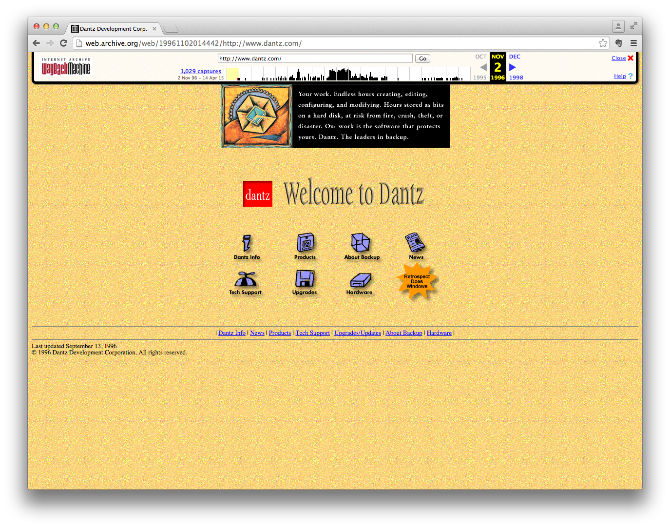
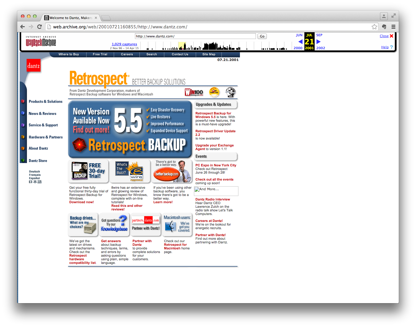
Two Decades of Retrospect
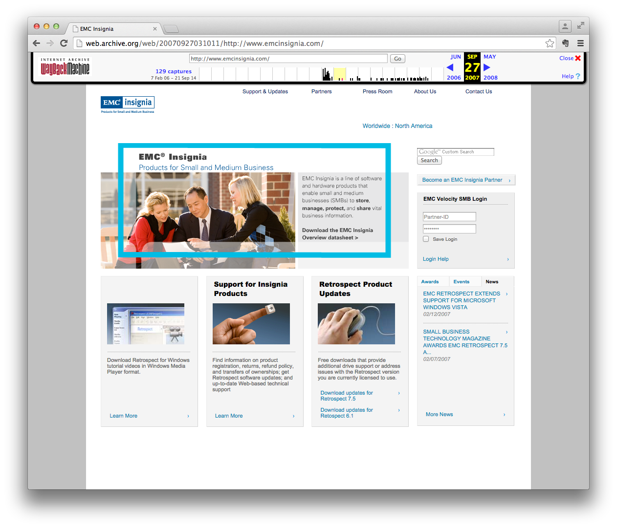
Dantz Development, the original company that created Retrospect, started in 1984. Most of the current team are alumni from it. When we started this project, we used the Wayback Machine to see what the original Dantz website had looked like through the years.
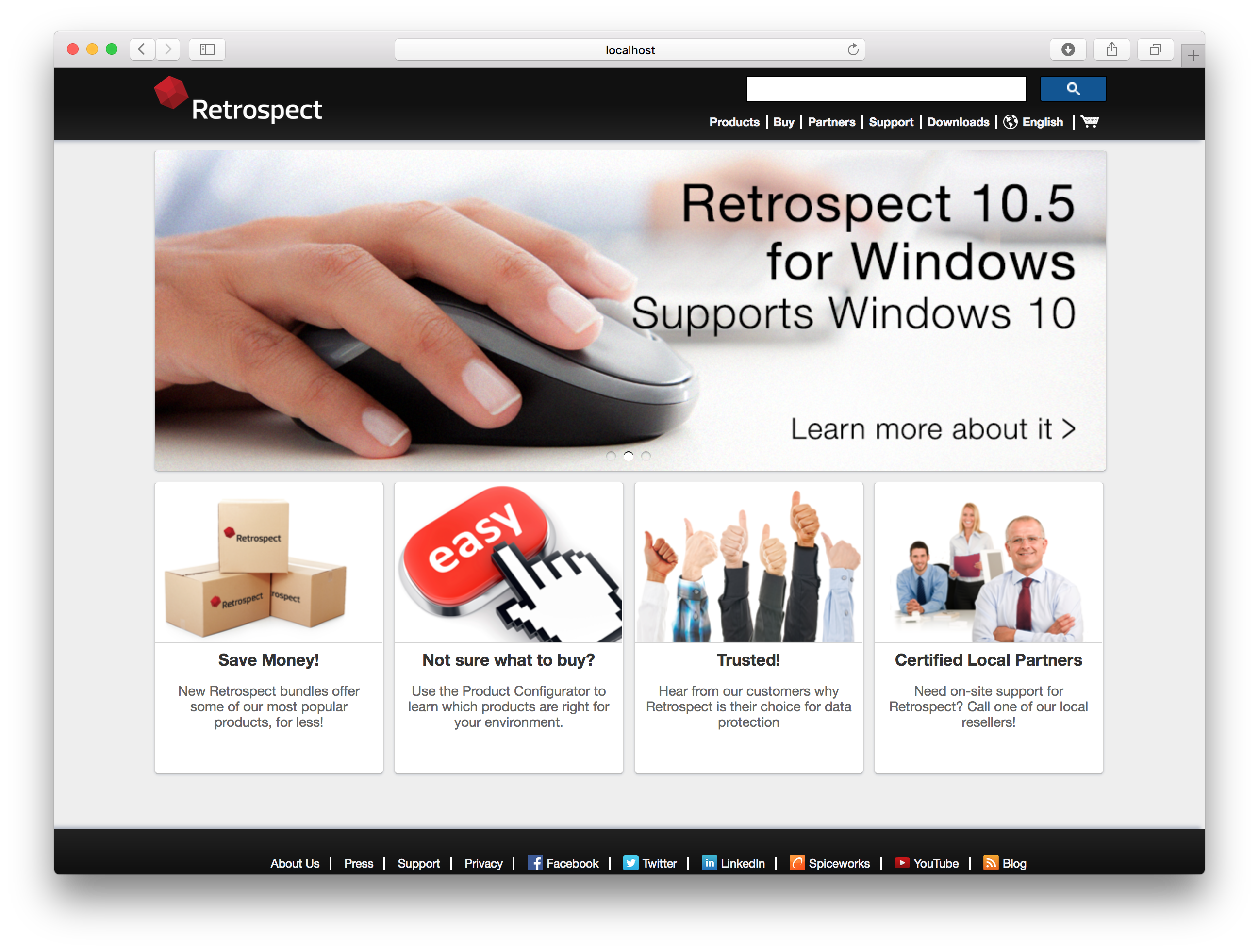
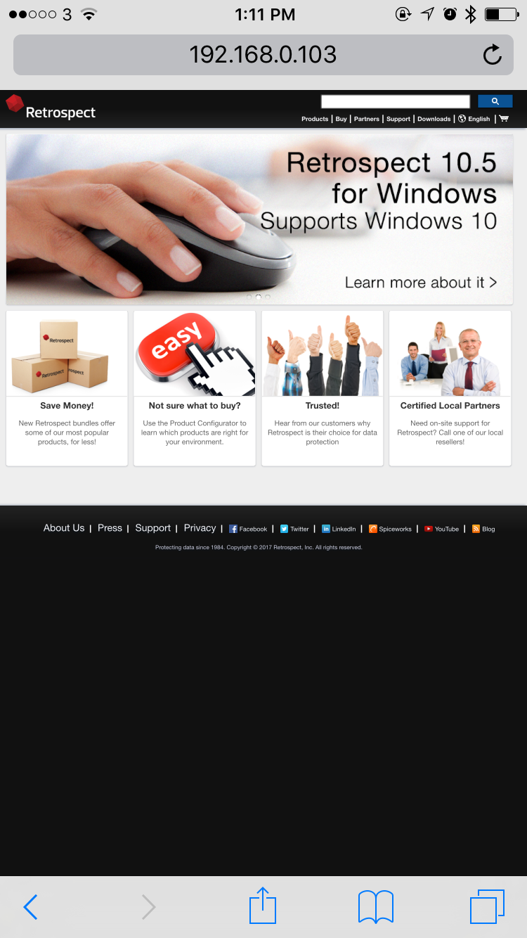
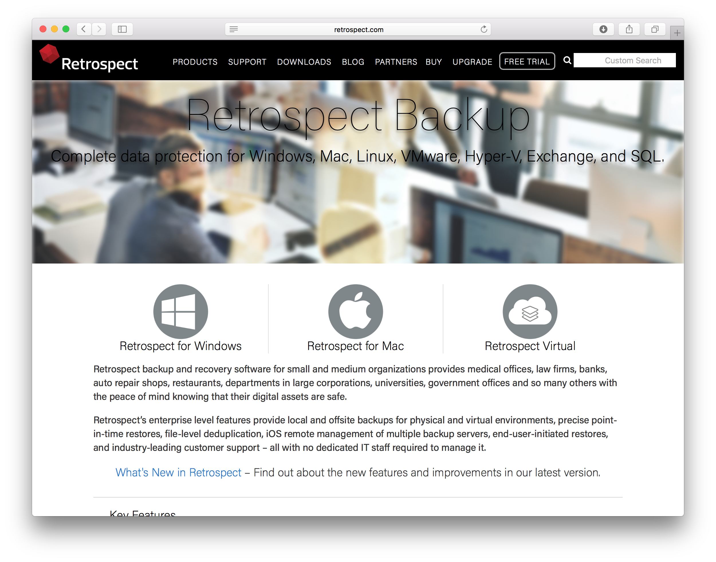
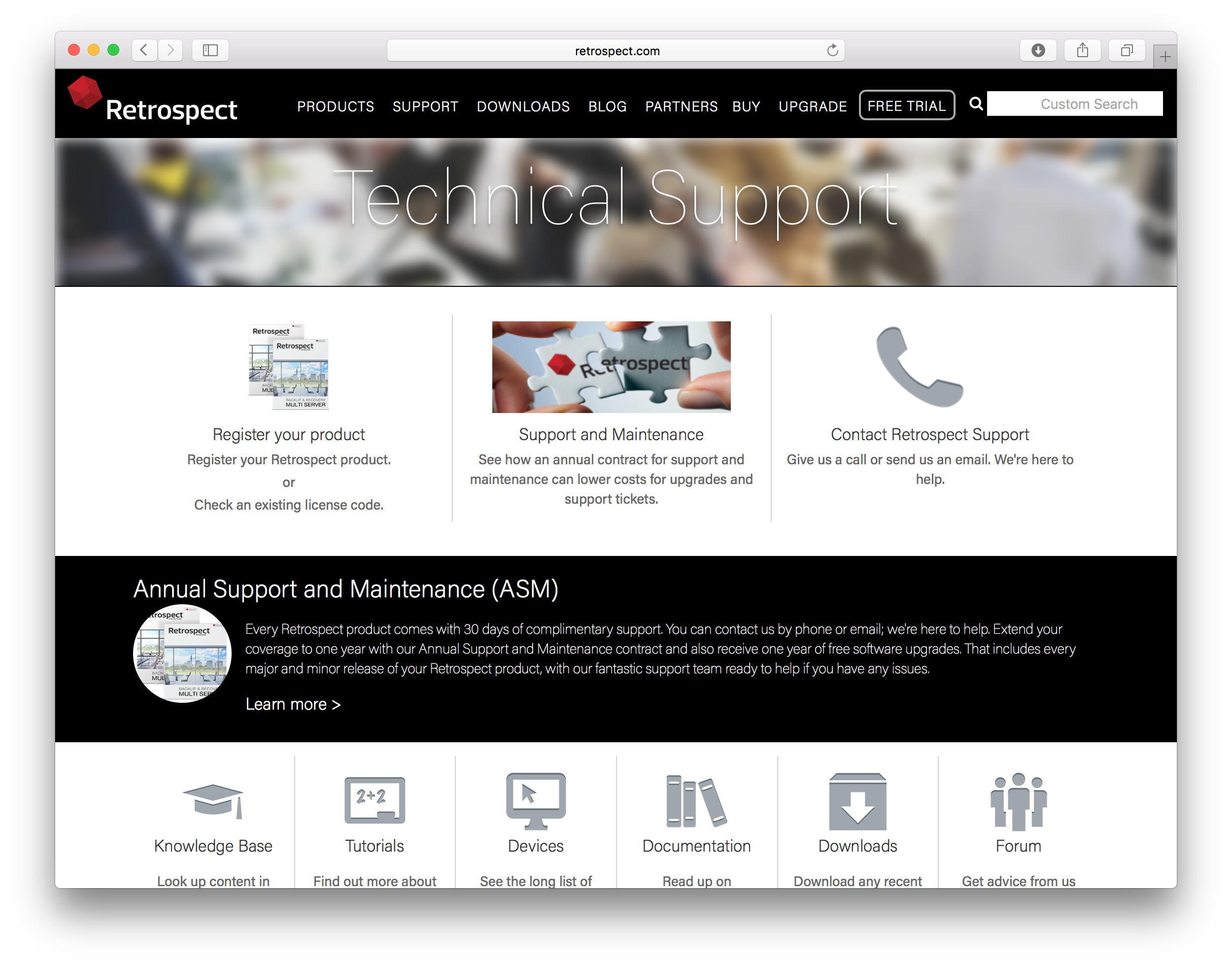
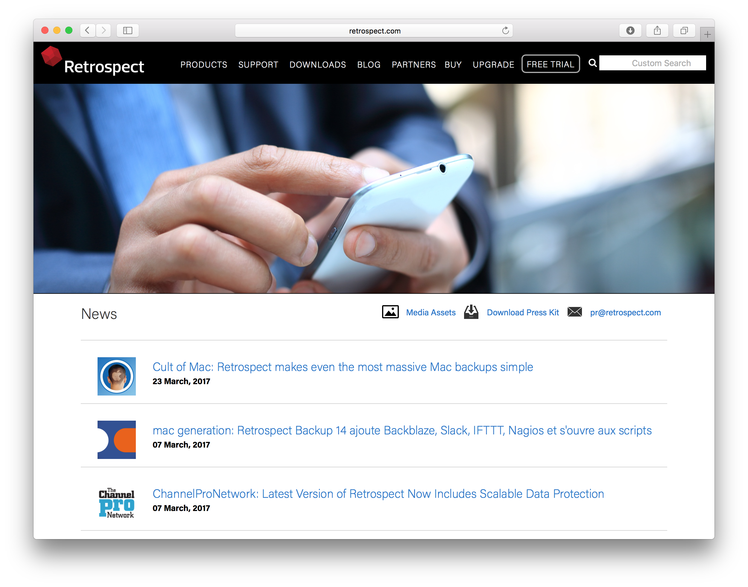
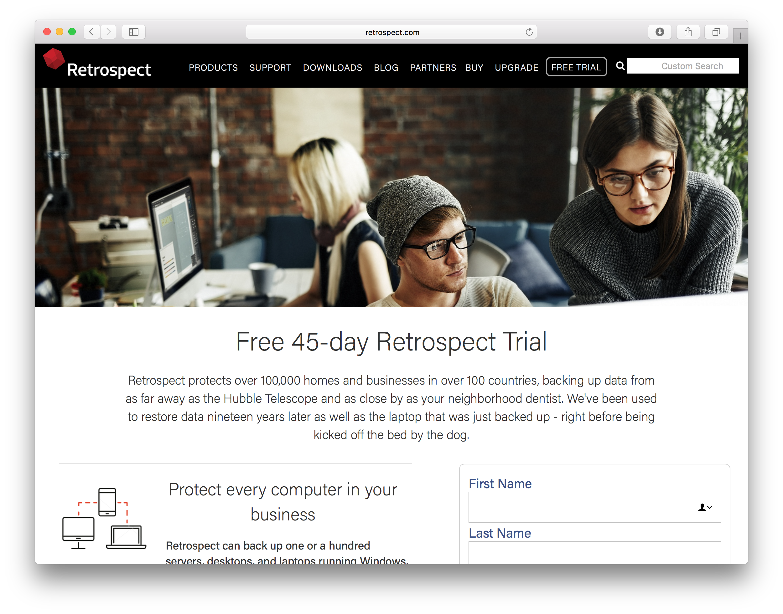
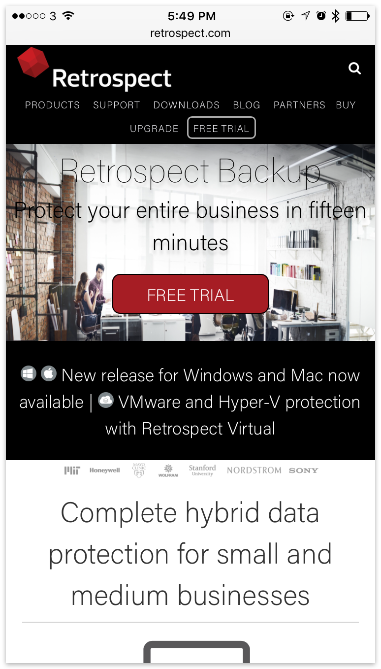
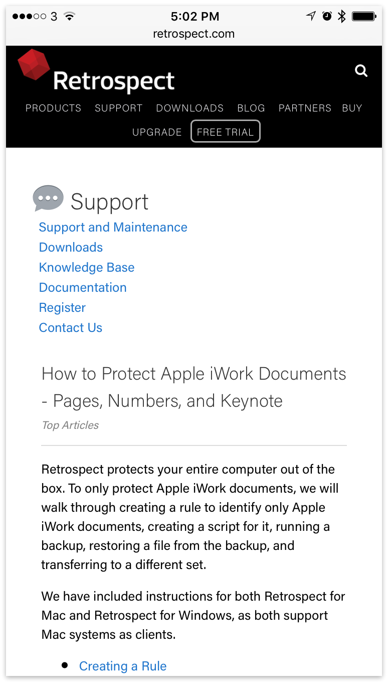
Current Site
Below are examples of our current site: